


Correlation analysis is a topic that few people might remember from statistics lessons in school, but the majority of insights professionals will know as a staple of data analytics. However, correlations are frequently misunderstood and misused, even in the insights industry for a number of reasons. So here is a helpful guide to the basics of correlation analysis, with a few links along the way.
Definition of Correlation Analysis
Correlation Analysis is statistical method that is used to discover if there is a relationship between two variables/datasets, and how strong that relationship may be.
In terms of market research this means that, correlation analysis is used to analyse quantitative data gathered from research methods such as surveys and polls, to identify whether there is any significant connections, patterns, or trends between the two.
| Tweet This | |
| In terms of market research, correlation analysis is used to analyse primarily quantitative data to identify whether there are any significant patterns, trends, or insights. |
Essentially, correlation analysis is used for spotting patterns within datasets. A positive correlation result means that both variables increase in relation to each other, while a negative correlation means that as one variable decreases, the other increases.
Correlation Coefficients
There are usually three different ways of ranking statistical correlation according to Spearman, Kendall, and Pearson. Each coefficient will represent the end result as ‘r’. Spearman’s Rank and Pearson’s Coefficient are the two most widely used analytical formulae depending on the types of data researchers have to hand:
Spearman’s Rank Correlation Coefficient
This coefficient is used to see if there is any significant relationship between the two datasets, and operates under the assumption that the data being used is ordinal, which here means that the numbers do not indicate quantity, but rather they signify a position of place of the subject’s standing (e.g. 1st, 2nd, 3rd, etc.)
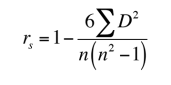
This coefficient requires a table of data which displays the raw data, it’s ranks, and the different between the two ranks. This squared difference between the two ranks will be shown on a scatter graph, which will clearly indicate whether there is a positive correlation, negative correlation, or no correlation at all between the two variables. The constraint that this coefficient works under is -1 ≤ r ≤ +1, where a result of 0 would mean that there was no relation between the data whatsoever. For more information on Spearman’s Rank Correlation Coefficient, there is a great document explaining the process here.
Pearson Product-Moment Coefficient
This is the most widely used correlation analysis formula, which measures the strength of the ‘linear’ relationships between the raw data from both variables, rather than their ranks. This is an dimensionless coefficient, meaning that there are no data-related boundaries to be considered when conducting analyses with this formula, which is a reason why this coefficient is the first formula researchers try.
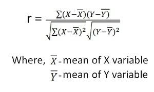
However, if the relationship between the data is not linear, then that is when this particular coefficient will not accurately represent the relationship between the two variables, and when Spearman’s Rank must be implemented instead. Pearson’s coefficient requires the relevant data must be inputted into a table similar to that of Spearman’s Rank but without the ranks, and the result produced will be in the numerical form which all correlation coefficients produce, including Spearman’s Rank and Pearson’s Coefficient: -1 ≤ r ≤ +1.
When to Use
The two methods outlined above are to be used according to whether there are parameters associated with the data gathered. The two terms to watch out for are:
- Parametric: (Pearson’s Coefficient) Where the data must be handled in relation to the parameters of populations or probability distributions. Typically used with quantitative data already set out within said parameters.
- Nonparametric: (Spearman’s Rank) Where no assumptions can be made about the probability distribution. Typically used with qualitative data, but can be used with quantitative data if Spearman’s Rank proves inadequate.
In cases when both are applicable, statisticians recommend using the parametric methods such as Pearson’s Coefficient, because they tend to be more precise. But that doesn’t mean discount the non-parametric methods if there isn’t enough data or a more specified accurate result is needed.
Interpreting Results
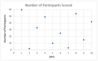
Typically, the best way to gain a generalised but more immediate interpretation of the results of a set of data, is to visualise it on a scatter graph such as these:
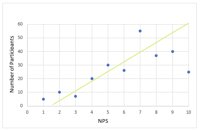
Positive Correlation
Any score from +0.5 to +1 indicates a very strong positive correlation, which means that they both increase at the same time. The line of best fit, or the trend line, is places to best represent the data on the graph. In this case, it is following the data points upwards to indicate the positive correlation.
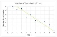
Negative Correlation
Any score from -0.5 to -1 indicate a strong negative correlation, which means that as one variable increases, the other decreases proportionally. The line of best fit can be seen here to indicate the negative correlation. In these cases it will slope downwards from the point of origin.
No Correlation
Very simply, a score of 0 indicates that there is no correlation, or relationship, between the two variables.The larger the sample size, the more accurate the result. No matter which formula is used, this fact will stand true for all. The more data there is in putted into the formula, the more accurate the end result will be.
Outliers or anomalies must be accounted for in both correlation coefficients. Using a scatter graph is the easiest way of identifying any anomalies that may have occurred, and running the correlation analysis twice (with and without anomalies) is a great way to assess the strength of the influence of the anomalies on the analysis. If anomalies are present, Spearman’s Rank coefficient may be used instead of Pearson’s Coefficient, as this formula is extremely robust against anomalies due to the ranking system used.
Correlation ≠ Causation
While a significant relationship may be identified by correlation analysis techniques, correlation does not imply causation. The cause cannot be determined by the analysis, nor should this conclusion be attempted. The significant relationship implies that there is more to understand and that there are extraneous or underlying factors that should be explored further in order to search for a cause. While it is possible that a causal relationship exists, it would be remiss of any researcher to use the correlation results as proof of this existence.
| Tweet This | |
| Correlation does not mean causation; however, a good researcher knows that the applications of correlation-based statistical insights are endless given the right data. |
The cause of any relationship that may be discovered through the correlation analysis, is for the researcher to determine through other means of statistical analysis, such as the coefficient of determination analysis. However, there is a great amount of value that correlation analysis can provide; for example, the value of the dependency or the variables can be estimated, which can help firms estimate the cost and sale of a product or service.
In essence, the uses for and applications of correlation-based statistical analyses allows researchers to identify which aspects and variables are dependent on each other, the result of which can generate actionable insights as they are, or starting points for further investigations and deeper insights.