


Storytelling is a great tool for communicating important insights, but how do we tell a story when communicating without words?
There are many forms of nonverbal communication, but the most predominant form is visual communication focussing on the sense of sight. With visual elements like imagery, GIFs, artworks, dance, and more, visual imagery and communication is immensely powerful, transcending language itself. In this way, the common phrase ‘show don’t tell’ takes on a whole new meaning. To use visual storytelling effectively in a research report, there are five rules to keep in mind:
1. Relevance is Key
Would you pay attention to something that wasn’t relevant? No? You’re not alone in that, because no-one pays attention to something irrelevant. But what does that have to do with visual storytelling?
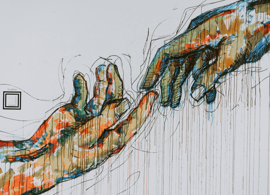
Communicating insights non-verbally means finding a way to present relevant insights and making sure to keep the relevance (or at least make it stand out as relevant so no-one misses it). This is something we’ve really had to research in the FlexMR Insight as Art campaign, and we have found that you can communicate relevance through both the subject and the style of insightful artworks.
The one thing that really helps, is to understand that context is everything and will help you distinguish the relevant insights from those that are just nice to know, especially when it comes to choosing an artistic style. There are so many stylistic movements for you to choose from, each with their own meaning and associations that add depth and relevance to the eventual interpretation.
One of Pixar’s 22 Rules of Storytelling is very apt in this scenario: don’t be too obvious in your depicting of insights; the more obscure you are, the more you can communicate. So, when you think about what picture you’d like to create to present your insights, don’t take the first idea that comes into your head, or the second or third. The more your think, the more obscure and relevant (packed full of the right, relevant insights) your story will be.
2. Don’t be Afraid of Tension
Stories move according to the plot, and so the images you create need to as well. The best way to create tension is to visualise conflict. Conflict can be visualised in a number of ways between styles, subjects, insights, consumer sentiments, etc.
Contrary to what you may believe, conflict and tension doesn’t have to be jarring in order to have the desired effect. Take the opening sequence of Disney Pixar’s Wall.E for example, an animated film set in a dystopian future, set to the soundtrack of the Barbra Streisand version of Hello, Dolly! the filmed musical set in 1890 New York. The contrasting animation/story and soundtrack complement each other nicely while also setting both atmosphere of the film and foreshadowing the events to come. This type of tension could come in very handy in a video report.
While you might not have the luxury of a soundtrack with your visual insights if your visual is imagery-based, but you can still create tension through conflicting styles and subjects within artworks: combining digital and traditional art styles; drawing a subject that contradicts the style they’re painted in; or even presenting multiple subjects in an image that openly contradict each other, but depending on how cleverly you do this it might be a bit too obvious and thus less engaging.
3. Movement Provides Great Stimulus and Direction
Tension can be very revealing and communicative, as well as help create movement through emotional travel; but it’s not the only way to create movement in an image.
Movement, if it’s relevant to the overall message the visual is communicating, can help attract the attention of your audience quicker, and can keep that attention for longer than if there was no movement at all. We are so used to seeing everything move, there is movement in all life, all stories, and most imagery; movement is communicative all on it’s own: it shows the direction the subject is heading while also giving it that all-important purpose. Ways to visualise movement in visual storytelling vary, but the most obvious would be to portray your subject mid-movement whether that’s running, walking, raising an arm, or simply looking in a certain direction.
Visualising movement in this way embeds the imagery with a form of energy that typically invigorates the audience if they’re paying enough attention. Another way would be to utilise time itself through formats like timelines, panelled art (like in cartoons), clocks, and labyrinths.
However, no movement at all is extremely startling to see, so if stasis is required then the lack of movement can be just as communicative as the insertion of movement. The lack of movement is in some ways harder to portray as we’re used to seeing movement all around, so creating a lack of movement in your visual story will take an immense amount of concentration.
4. Just Because it’s Visual, Doesn’t Mean it Can’t Communicate a Narrative
I once stated in another blog that art is the oldest form of storytelling, but not only that, art is the oldest form of communication! The reason why art is the oldest form of communication, is because it tells a story. Think back to the cave paintings of the Neanderthals, which used to serve as warnings of local dangers, and paint pictures of the locals who lived there or significant historical events; the reason why they worked was because they told stories before the written word was invented. The earliest cave painting is around 44,000 years old in Indonesia, whereas the first documented written word dates back to only 3200 BC.
Using movement and tension, you can create a pretty good scene, but there are so many more elements needed to create a fuller narrative, elements you can get from your insights. Characterisation and world-building and the first two that spring to mind; what do your insights tell us about the characters (your target audience and participants), what do they like, dislike, do on a daily basis, what are the most common opinions expressed in your research? And then set those characters in the world in which they live, and while you think this might be easy, their world will be significantly altered by their beliefs, their daily routines, the brands they frequent and the people they interact with on a daily basis.
5. Focus
Focus is the key to a good story, visual or otherwise. Don’t get lost in the details, keep it focussed on key themes presented within the insights and you’ll be able to come up with a creative visual story much easier than if you were to account for all the minor themes too. Don’t put in too much information, and keep the structure simple. This will help you keep in control of your story and reveal only what you want, when you want to reveal it. Focussing on the key insights will also help you do justice to those key themes, representing them in a way that will communicate them accurately, in-depth.
There are a few guides to help you keep the focus, with one being a Rule of Thirds; this is a theory that shows how an image should be composed in order to create an aesthetically pleasing result, where the focus of your audience’s attention will be; it involves splitting an image into nine equal squares and arranging the subject(s) on where the lines intersect. There are many ‘rules of thirds’ that you could adhere to, a creative writing example would be to always list in threes for the best effect, but for visual storytelling, aesthetic and focus are key components. This particular Rule of Thirds shows us where the focus should be to attract the most attention, but use this guideline wisely.
Storytelling for Impactful Presentations
Even though I’ve focussed on visual storytelling in this blog, these five rules are easily transferable to other forms of communication too. Relevance, tension, movement, narration, and focus, are all key aspects to keep in mind that will help strengthen your presentation, and make your audience actually want to pay attention.
There are other storytelling articles on the FlexMR website to help translate these aspects across, but do keep visual storytelling in mind as we’ve proven in our Insight as Art campaign that it does create very engaging and impactful presentations!