


There has never been data and insights so complex as they are now. A confident statement I admit, true nonetheless. The data we have access to now is almost infinite, and with the right combination can reveal intimate knowledge about everyone on the planet. It has been gathered through a multitude of different research methods, focus groups, surveys, gamified research, etc. and there is still more data being added to the mix every second of every day. So how on earth are we meant to sift through it all to find what we need and present it in a way that makes sense, is engaging, and is relevant?
You might think that the written reports that have been a specialty of our industry for some time now are still the answer to this question, and they might just be for now, but think about what we could do with a little creativity. Think about how we could innovate beyond and in conjunction with the written word, to communicate the insights we need to with the same dependable gravitas but drastically increased stakeholder engagement.
1. Art/Sculpture
I wanted to mention this one first, because it’s one we’ve actually already had a bit of experience with in our industry. At FlexMR, we conducted our Consumer Postcard Project in 2019 with resounding success, proving that insight professionals could in fact translate key insights into highly-provocative thematic artworks that would still have the same effect as traditional written reports.
But artistic postcards aren’t the only technique to pursue; images in general are brilliant to add into reports or centre reports around. Unexpected and shocking images are brilliant for breaking up the white space and blocks of text, and can be used to represent or further emphasise the insights in a different and more intriguing way. (NOTE: these don’t have to be negatively shocking, but images that inspire negative emotional responses tend have been proven by psychologists to be the most memorable.)
However, one example of a neutral (potentially positive) image that is proven to catch the eye more often than not, are anachronisms. The feeling that something isn’t right with an image will entice the audience to engage more to find out what it is that’s niggling at them.
2. Interactive Experiences
Interactivity is the boon of creative engagement. Depending on the situation, this aspect alone can drastically increase the engagement in our insights. There are many interactive experiences that researchers could employ depending on the time available to your audience and the budget you’re working with.
Augmented or virtual reality experiences are one of the most immersive interactive exercises you could use, and as such are great mediums for storytelling insights. If you could create any world to set your insights into to give them the most impact, what world would you create? If you combined this technique with the art/sculpture point above, you could create a virtual exhibition of artistic insights and let your audience wander around, taking in the story at their own pace.
However, there are other interactive avenues you could explore, for example, interactive data visualisation. Now by data visualisation, I don’t just mean the standard charts, tables, and graphs that you can find on PowerPoint. As an example, these developers turned complex information about why buses can bunch together into a game that the audience can mess around with. While not interactive data visualisation, David McCandless’ Ted Talk, explores how you can make static data visualisation more interesting, relevant, and engaging for the audience outside of the traditional bar and pie charts.
Insight workshops are another method to consider; The FlexMR Activation Programmes, for example, can be used for both the presenting of research results and the recommendations on how to use them to their full potential. This type of seminar, if using their own insights gathered from the research could also spark more interactive engagement with said insights.
3. Stories
Nancy Duarte says in her TED Talk, “[Presentations] have the power to change the world, when you communicate effectively through them… the way that ideas are conveyed most effectively is through story.” I would really recommend watching this, because it explores brilliantly how traditional storytelling can be integrated into a presentation to make it captivating and persuasive, which are the two most important emotions we need to strike with if we want to engage your audience. There is a shape to a great presentation or speech:
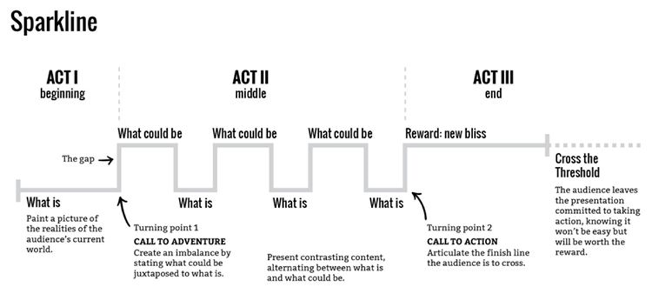
But along with this shape, there are other techniques that need to be incorporated in order to make a brilliant story. Make sure to keep it light and concise, and know what narrative you want to tell, because there are many that you can choose from: character-focussed, timeline-focussed, theme-focussed, plot-focussed, etc. Metaphors and analogies are brilliant for simple and quick stories. They are the neatest trick for making complex issues and data points relatable to an audience, and easy to understand first time.
4. In Advertisements
Motivation is everything. I’ve mentioned this in another blog, but I will mention it again because it’s an important sentiment to understand: in his Ted Talk Simon Sinek states that “people don’t buy what you do, they buy why you do it”. So, if you’re a business owner, stakeholder, or manager, think about those who work for you. What motivates people to listen to our insights? What motivates your employees when they work for you? Do they work for your paycheque or do they work because they believe in what you’re doing? How can you ensure that it’s the latter?
One of the more out-there ideas to communicate complex ideas and insights is through in-business advertisement. Displaying posters up in public areas, sending out newsletters and dynamic infographics with those complex ideas on them, using prolonged exposure and making this information so integrated into their daily life so they know the all-important ‘why’ of your business motivations so they incorporate it into their own motivations and work for you happily with their whole being.
5. Animation/Video
There is a lot that we can do with animation and video to present complex information. From embedding these elements into presentations to them being the sole medium of presenting insights, animation and video are one of the easiest visual mediums to engage with. This may seem like a very simple notion, but making a video or animated video takes a just as much creativity as creating an artistic postcard, if not more simply because of the extra considerations such as movement, transition, and pace. However, there are many ways you can use video in your reporting.
You could combine this video suggestion with the interactive one above, and create a ‘choose your own adventure’ type game where the players take themselves through the insights generated and are a part of the story being told. Or use simple animation to emphasise your points through animated data visualisation, but the key to this is to find that fine line between engaging creativity and cheesy, because while creative inspires attentiveness, cheesy will undermine the underlying message and enable your audience to switch off without fear of missing anything important.
Complex ≠ Complicated
There are so many creative ways to explore when presenting complex information, that it was incredibly hard to write about as many of them as possible in this blog. But one thing you need to determine before you embark on this journey is, is your information complicated or complex? Because contrary to popular belief, the two terms are not synonymous.
Complex information means it has many levels of meaning, and as such needs a lot of creativity in order to accurately communicate these meanings to an audience. Complications on the other hand are something to be solved. If you’re information is complicated, you need to take a step back and solve the issues before you try to present them to others.